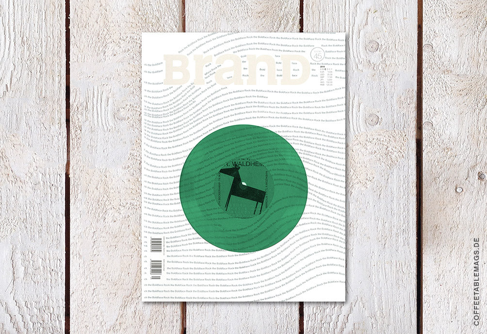
BranD Magazine – Issue 45: Rock the Boldface
Couldn't load pickup availability
BranD is an international bi-monthly magazine, focusing on multidisciplinary communication design from Hong Kong.
BranD defines a new way to look into Communication Design by presenting, researching and manifesting excellent works amongst Visual Art, Advertising, Product, Graphic, Interior, Architecture, etc. Every issue not only expends around numbers of high-quality visual features to seek the real content and values behind different forms of communications, but also includes in-depth observation articles andcolumns from the industry’s leading organizations and individuals. The Community section brings the designers, artists, art directors, marketing specialists, and business strategists together to seek the multidisciplinary creative methodology behind communication design for businesses.
Rock the Boldface
BranD 45 | No matter what job you are engaged in, you have to deal with fonts every day, for writing papers, doing reports, and designing layout, etc. Sometimes we don’t know why we can’t get high score though the content of paper is much excellent. The report is professional yet it still can’t be adopted. Actually, layout design is a subtle factor for any documents. Layout design as a term may be too professional to understand. So, in other words, choosing suitable fonts for the main body and headline in an article can increase the reading comfort and get a better result. To realize the significance of fonts to reading, choosing a font in our life though appearing trivial becomes increasingly important.
If you ask which font we should choose? It’s better to ask whether we should choose sans-serif or serif.
Although there are various types of fonts, sans-serif and serif are being used the most. In Chinese, fonts without serif are called Boldface. The scope of this term here is similar with sans-serif. Therefore, the name “Boldface” is used in Chinese character, while “sans-serif” is in Western character. The most popular font in the world – Helvetica (meaning Switzerland) is sans-serif. In this case, is the san-serif the most used font? I think so. You don’t? Just open your mobile phone or computer and try to obverse carefully. You will find that there is sans-serif all over the screens. And on the street, facia, advertisement, license plates, doorplate and more are also in sans-serif. However, when one thing appears frequently, it is seen like air, to which people turn a blind eye.
Even if it has another side? BranD decides to dig deep into the visual art of boldface, turning publication of magazine into limited artwork!
Old records & Boldface: spending one year to turn magazine into limited artwork!
It’s universal as it’s classical. Our reverence toward boldface comes from the unchanged initial heart and enthusiasm for magazine. BranD publishes an issue of font once a year, and every issue was out of print and became classical. This time, we tried our best and spent one year to collect vinyl records from the 50s and 60s around the country. They represent the civilization at that time. Design, font, and music, all kinds of culture were sprouting. That was the beginning of the present classical trends. BranD associates records with font, designing the cover into record bag. Every cover has a record in it.
We want to tell the designers worldwide that classic means standing the test of time. Classical things deserve to be collected, should be collected and need to be collected, because the quantity of these records is much limited. Such things may never be played again! This kind of records might soon be declared out of print!
Content
1. Dialogue with the most popular font in the world – Helvetica.
2. Each magazine has a vinyl record (3 colors). Each color is sent randomly. It need to be played on professional players (It can be played under normal conditions, but there is no guarantee. Records can not be returned or changed due to the limited quantity).
3. Dig deep into the visual art of sans-serif in the world.
4. Dialogue with the independent magazine distributor Stack.
Share


